
Have you ever seen CO2 concentration in the atmosphere (ppm) calculated based on actual emissions juxtaposed with the Keeling Mauna Loa observed atmospheric concentration?
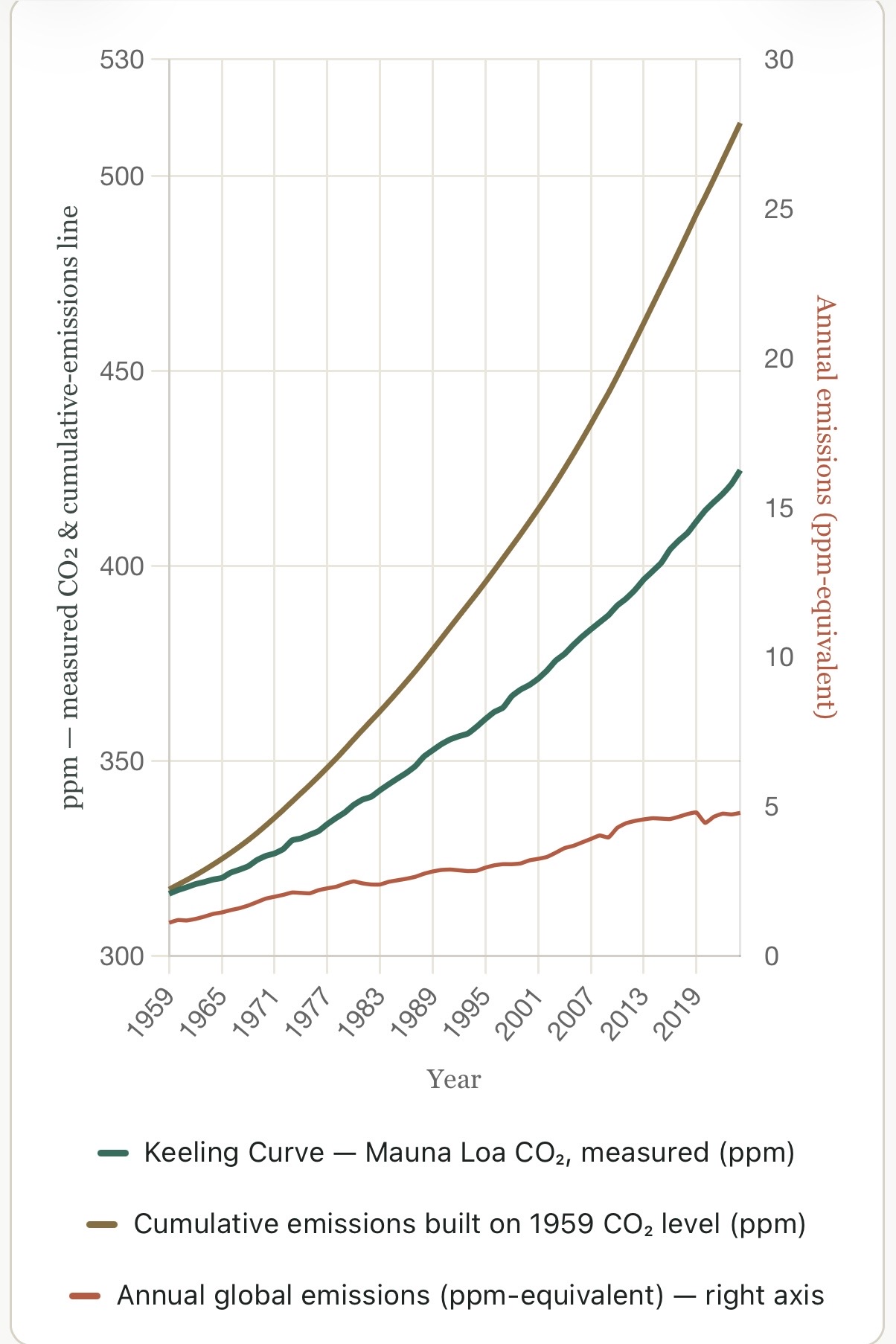
The chart below shows CO2ppm scaled on the left y-axis, ranging from 300ppm to 530ppm.
The top BRONZE CURVE is calculated ppm equivalent of global emissions accumulations since David Keeling began taking atmospheric CO2 concentrations at Mauna Loa, Hawaii.
The middle GREEN CURVE is the traditional KEELING CURVE
The difference between the GREEN and BRONZE curves is what has been sequestered into the ocean, vegetation and soil.
The bottom RED CURVE is global annual CO2 emissions which start to level off a bit in recent years. CO2ppm scale on the right y-axis shows atmospheric concentration additions from annual emissions having climbed four-fold from ~1.1 ppm-equivalent/yr in 1959 to ~4.8 ppm-equivalent/yr in 2024.
This set of curves was generated by Claude AI based on my vision and iterative instructions, correcting Claude’s non-human inability to visualize what I described in text, until the result was simple and clear enough for the layperson and scientist or policy-maker to quickly grasp the predicament we face:
HOW QUICKLY CAN WE POSSIBLY TURN THE TRAJECTORY INTO A COOLING TREND?
Global Mean Surface Temperature follows the total CO2 concentration in the atmosphere, hence to bend the warming trend downward into a cooling trend will require reducing the CO2 concentration in the atmosphere as well as in the ocean as the two will equilibrate as CO2 is removed and sequestered in the soil, vegetation or send into the abyss of the ocean as solid organic compounds (e.g., phytoplankton, krill, kelp, whale poop, calcium carbonate, etc.)
Claude is very intelligent, and has assisted me organizing my experiences and thoughts as well as articulating complex concepts clearly and concisely. Following is Claud’s explanation of the curves:
The Keeling Curve, with emissions stacked on top
Two lines, both starting from the same point in 1959: the actual measured CO2 level (green), and a hypothetical line (bronze) built by adding each year’s global emissions on top of that same starting point, as if nothing were ever absorbed. The gap that opens up between them is what’s been sequestered. Annual emissions sit on their own right-hand scale below, so their rising trend stays visible.
Reading it: both lines start at 316 ppm in 1959. The bronze line just keeps adding that year’s emissions on top, year after year, as if the atmosphere kept every molecule ever released. The green line is what actually happened. They separate almost immediately and keep widening: by 2024 the bronze line reaches about 514 ppm, while the actual atmosphere measures 425 ppm — a gap of roughly 89 ppm.
That gap is the running total of everything land and ocean sinks have pulled back out of the air since 1959. The right-hand axis shows the annual flow behind it: emissions climbing from ~1.1 ppm-equivalent/yr in 1959 to ~4.8 ppm-equivalent/yr in 2024.
Sources & method: Mauna Loa annual-mean CO2 is the actual Scripps/NOAA Global Monitoring Laboratory record (1959 is the first complete annual mean; Keeling’s instrumental record began March 1958).
Annual global fossil CO2 emissions are approximate figures reconstructed from published Global Carbon Project / Global Carbon Budget benchmarks, interpolated year-to-year through documented turning points (1974 oil shock, early-1980s recession, 1991-93 Soviet collapse, 2009 financial crisis, 2020 pandemic).
The bronze line is the 1959 starting ppm (315.98) plus the running sum of that emissions series, converted to ppm using 1 ppm CO2 = 7.81 GtCO2 (2.13 GtC/ppm × 3.664 GtCO/GtC).
Land-use-change emissions (deforestation, etc.) are excluded throughout for methodological consistency – including them would push the bronze line, and the sequestration gap, higher still. Emissions figures are illustrative of scale and trend, not precise official annual statistics.


